Radiobutton and Checkbox Icon
Arclab® Web Form Builder
Arclab Web Form Builder uses its own CSS classes to display radio buttons
and checkboxes and not the browser-dependent standard icons.
For the icons
the 'Material Icons' font is used.
You do not have to make any changes yourself, but you can easily choose the look through the "Style Templates":
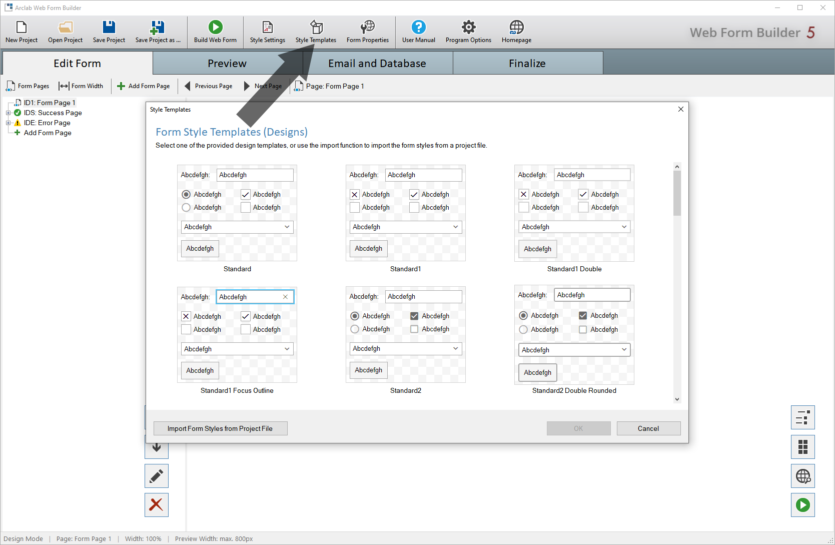
For the radio button or the checkbox templates there are round and square
buttons available.
Each template is configured to match the element sizes
and spacing within the templates.
Please note that the following section is aimed at experienced web developers.
All others are recommended to use one of the included "Style Templates".
If you do not want to use a template but want to change the icon manually,
click on "Style Settings" and select "Radio Button"
(or "Checkbox" to change the checkbox icons):
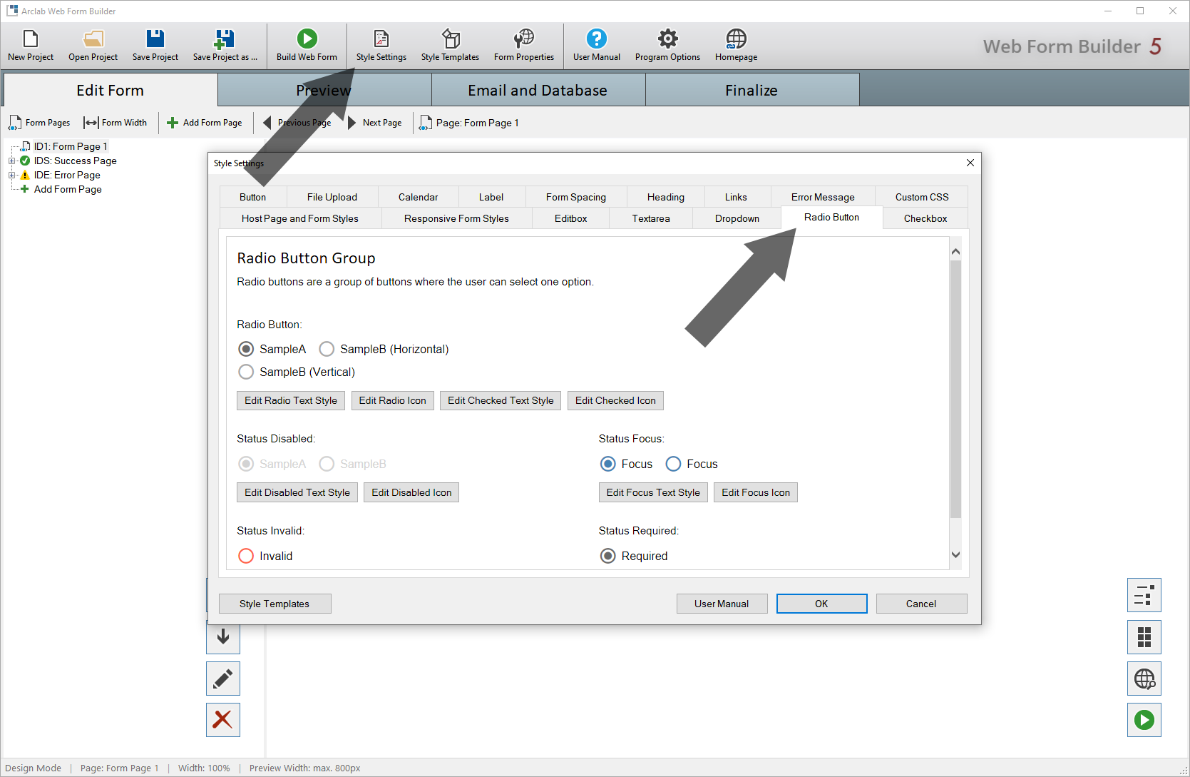
With a radio button or a checkbox there are two main states: "Checked" and "Unchecked".
With the default template no icon is inserted for the unchecked icon,
but a frame is drawn (using the CSS border style property).
If you would
like to use an icon for both states, it is recommended to first select a
template under "Style Templates" which uses icons for both
states.
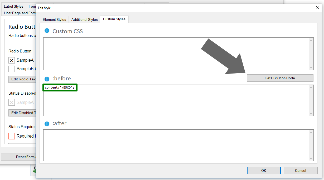
Click on "Edit ... Icon" to open the style dialog and
select "Custom Styles".
The icon is inserted using the
CSS :before selector. Click on "Get CSS Icon Code" to select
a different icon.
In this example, we have loaded a "Style Template" that uses an icon for both states (checked and unchecked) before:
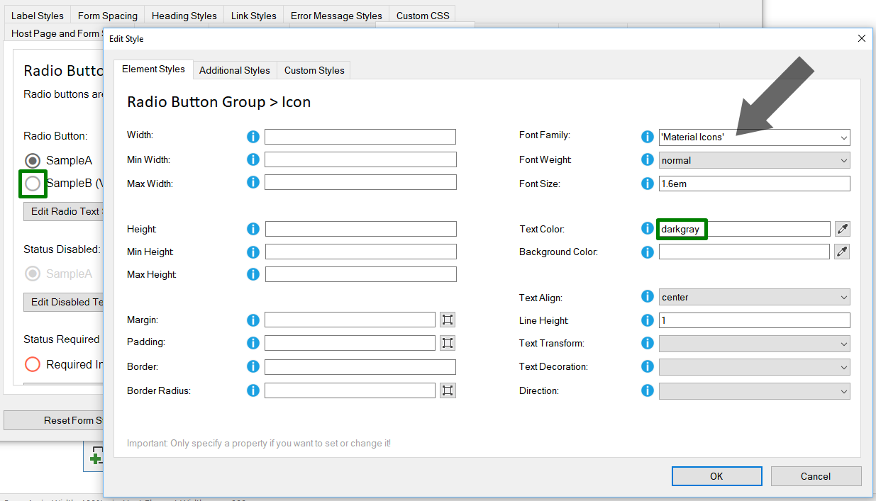
Important: The font of the "unchecked" standard element must be set to 'Material Icons'.
The icon color of the respective state can be made via the "Text Color"
setting.
In the above example the default is "darkgray" and for the "checked"
state "dimgray". ("dimgray" is darker than "darkgray")