Responsive Form Styles
Arclab® Web Form Builder
Use Responsive Styles of Host Page
The form usually adapts automatically to the width of the host page or host
element.
That means if the width of the area containing the form changes,
the form width is automatically adjusted to the new width.
All
you have to do is using a form width of 100%. This is the default.
In addition to the width, the font size also changes for most responsive
pages. This is also automatically taken over from the host page or host element.
That means the font used in the form corresponds to the font of the host page.
If the font size of the host page changes, the font size of the form also changes.
No settings in the form are necessary for this.
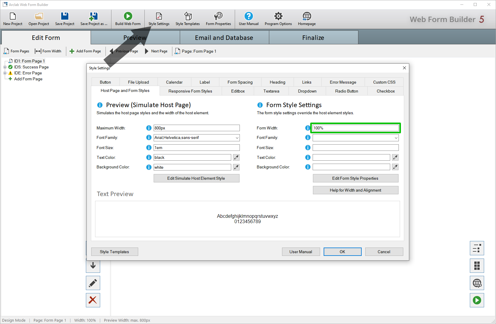
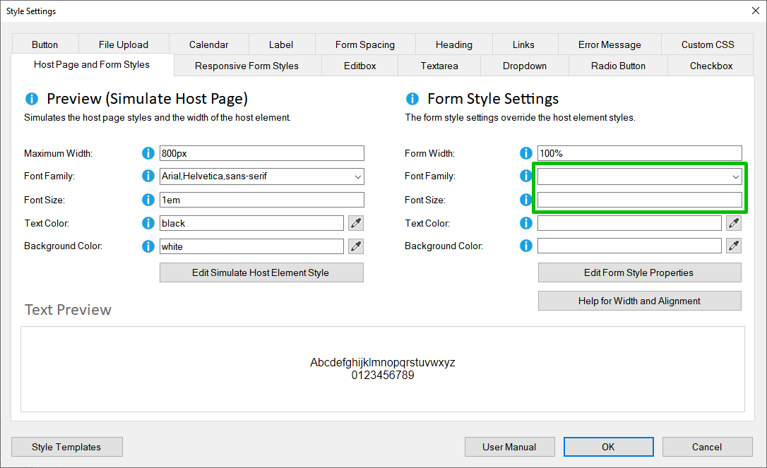
The "Form Style
Settings" for "Font Family" and "Font Size" should be empty. This is the default.
If you want to use a different font size, width or other style, you can set this as described in the next section.
Use Custom Responsive Styles
If you want to use a responsive font size or width that differs from
the host page (or host element), you can set this under:
"Style
Settings" > "Responsive Form Styles".
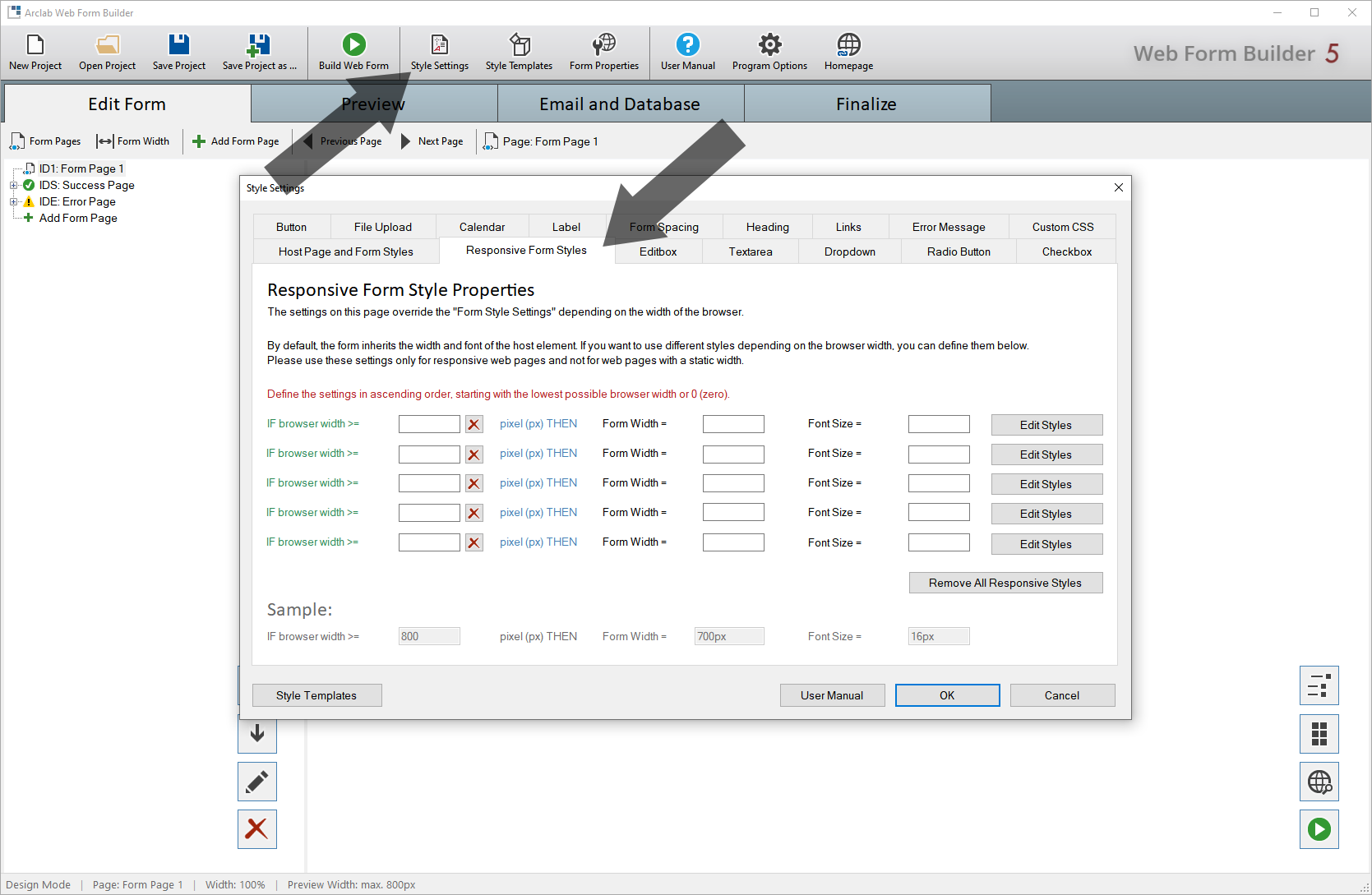
Responsive "Font Size":
If you only want to change the font size, leave the "Form Width" field
or other styles blank.
The following example shows the usage:
The styles depend on the width of the browser or the display resolution
for mobile devices.
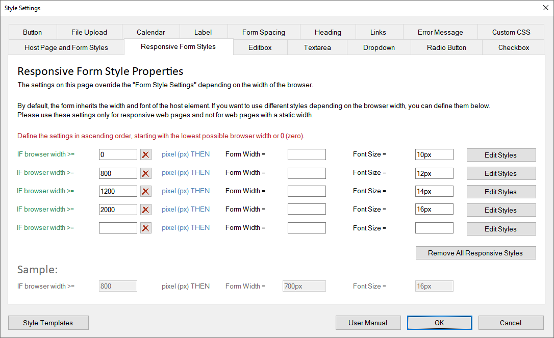
Define the settings (based on the browser
width) in ascending order, starting with the lowest possible browser
width or 0 (zero).
If the browser width is between 0px
and 799px (800px-1) the "Font-Size" should be 10px.
If the
browser width is between 800px and 1199px (1200px-1) the "Font-Size"
should be 12px.
If the browser width is between 1200px and 1999px (2000px-1)
the "Font-Size" should be 14px.
If the browser width is greater than
2000px the "Font Size" should be 16px.
The "browser width" is always in px (Pixel), so you
don't need to add "px" for browser width.
The "Font Size" and "Form Width"
could be defined in different units, like px, pt, em, ... so you need to
add the unit here.
Responsive "Form Width":
The form width can be defined in the same way as the font size.
Please note that the form should not be wider than the space provided in the host page.
If the available space is already set in the host page, it is recommended to keep the default width of 100%.
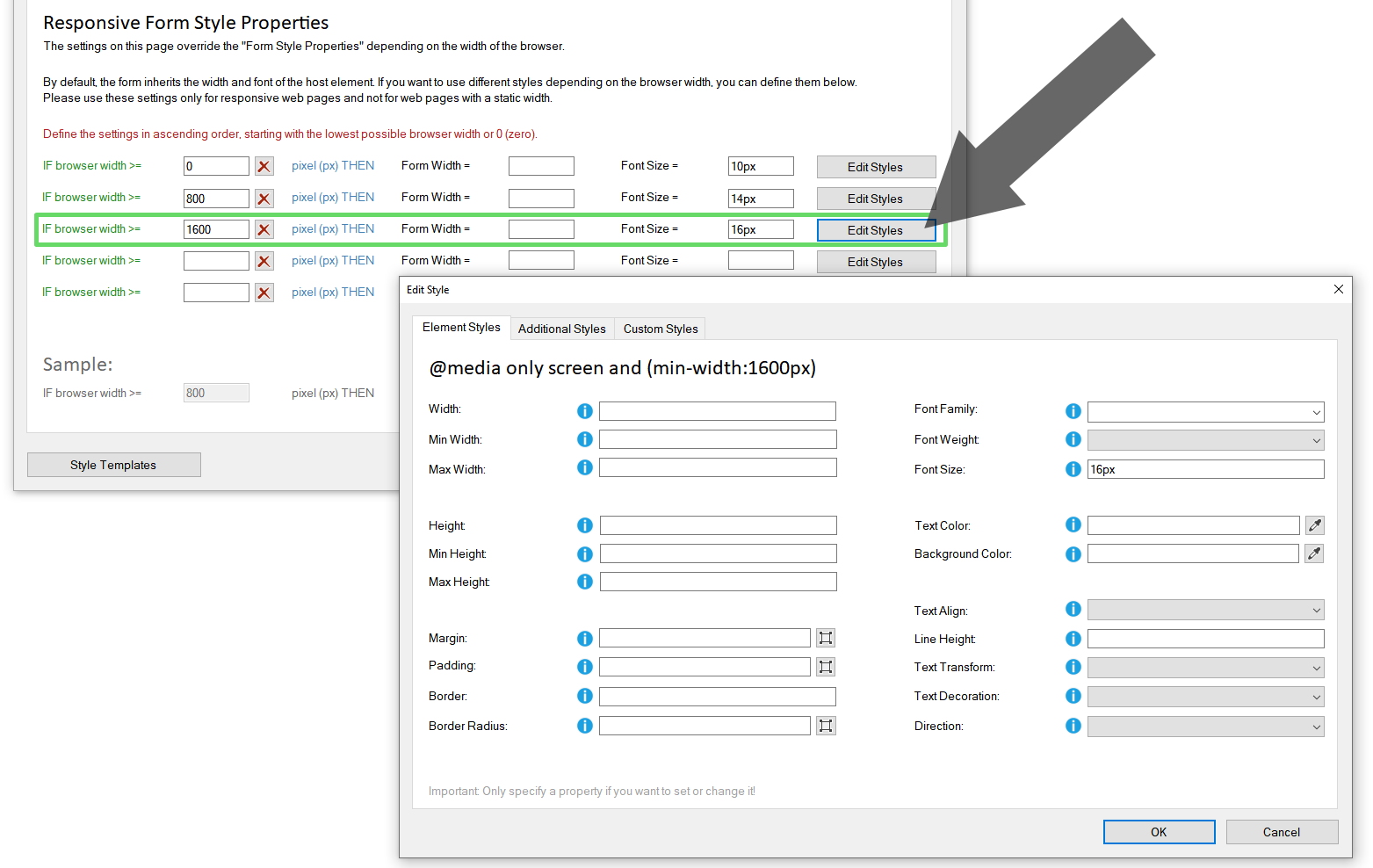
Other Styles:
In addition to the form width and font size, other styles can also be
set depending on the browser width.
Click on "Edit Styles"
to open the styles editor: