Radio Button Group
Arclab® Web Form Builder
What is a Radio Button Group?
A radio button (group) is an input element that allows the user to choose only one of a predefined set of mutually exclusive options.
- You can use either square or classic (round) radio
buttons (depending on the selected "Style Template").
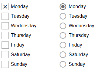
See: Change the Checkbox and Radio Button Icon - You can choose if and which option is selected by default.
- The radio button group can be arranged horizontally or vertically.
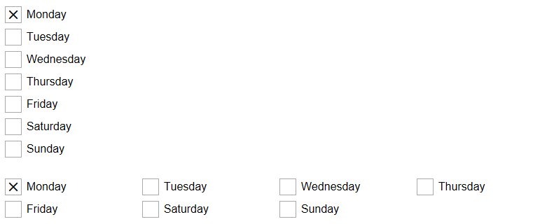
See: Radio Button and Checkbox Group Item Alignment
Add Item to Group
A radio button group can contain a basically unlimited number of items.
Click on the "+" plus icon to add the first item:
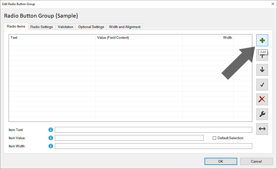
Select the item and change the "Item Text" and "Item Value":
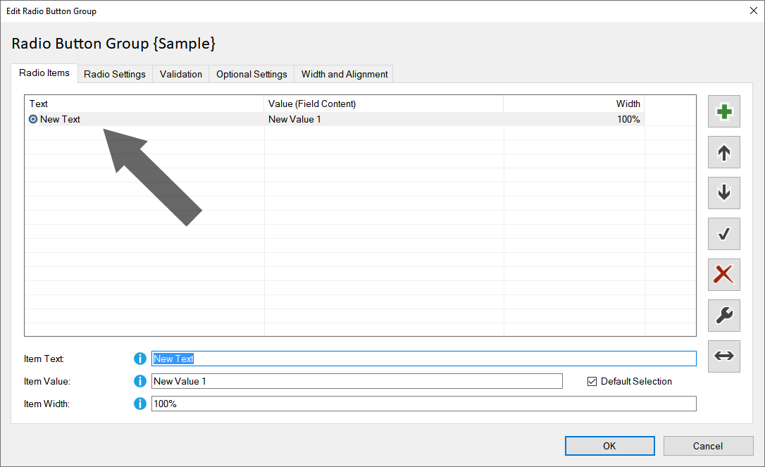
Item Text:
The item text defines the text shown in the form.
Item Value:
The item value defines the value for the selection.
The "Item Value"
is the value that should either be transferred by email or inserted
into the database.
Field Name:
Each input element has a unique field name through which the content
can be accessed.
Each time the user inputs, the content of the form elements
is automatically updated. See also:
Field Name
Default Selection:
Check the option "Default Selection" to set the selected item as default
selection.
You can also uncheck the option to set no default selection
for the group.
Hint: You can also double-click on an item to change the
"Default Selection".
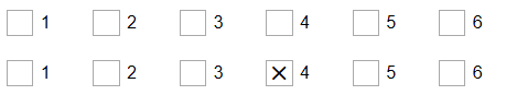
Item Width:
Radiobutton groups can be aligned both horizontally and vertically.
Furthermore, a combination of vertical and horizontal alignment is possible,
wherein the width of each element can be set individually:
- Items are arranged side by side until the total width reaches 100%.
- If the total width exceeds 100%, a break is automatically inserted.
- An item with 100% width fills an entire row.
Tools: Insert Bulk, Sort and Delete Items
Click on the "Tools" icon:
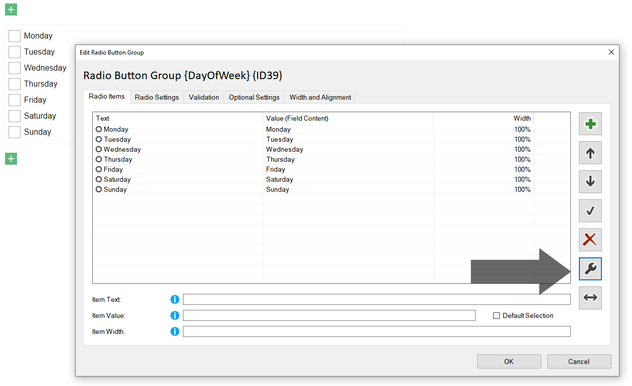
See: Radio Button, Checkbox and Dropdown: Insert Bulk, Sort and Delete